To paraphrase an old saying - How can I support accounting information, let me compute the ways. The intersection of numbers, words, images, and ideas are wrapped in the world of the visual. What you see is what is remembered – whether it be words, numbers, a beautiful sunset or a form 1040. The bottom line is that pictures are always easier to remember than words or numbers.
Using graphics and images has become common place in business and personal communication. Handwriting has been made legible by a dizzying array of font styles and sizes. Color can be added to words and numbers. Being in the red can actually use that color to make the bad news stand out. The traditional multi-column paper has given way to automated spreadsheets. Charts show lines, bars, pies of all sizes and shapes can easily be created. Inserting pictures, of yourself, of your partners, of the new facility, of next year’s products can all be inserted and made a highlight or integrated component.
This article focuses on the ways and whys of inserting graphics within the range of work that accountants perform on a regular and an irregular basis. My goal is to encourage you to use graphics and images. After all, the entire world is using graphics and images – from CNN to YouTube to commercial movies to amateur photography to business and personal blogs. And then you can conduct one of those perplexing debates – using graphics versus NOT using graphics.
A Few Basics
The separation between left brain (logical, numbers) and right brain (visual, artistic) folks is clearly narrowing. It needs to be acknowledged and understood that business reports need to be elevated away from the boring black on white showing endless tables of numbers that are never read. With the right software, accountants can convert dull-looking documents into readable and read presentations that engage the viewer to make sense out of the endless reams of confusing data.
Let’s start with what most already know about graphics. If you are not part of this knowledge base, buy a book or get thee to a training course, now.
Word Processing, most use MS Word
Can benefit from the right type and size of font
Adding bold or italics to words helps them stand out
Making certain words or phrases larger adds emphasis
Color can be added
Lines and underlines can be single or double or fancy
Spreadsheets, most use MS Excel
Every font embellishment for Word Processing can be done for spreadsheets
Columns and rows can have shading
Any grouping of numbers can be converted to a graph or chart
Presentations, most use MS PowerPoint
Every font embellishment for Word Processing can be done for presentations
Multiple designs are available and easily inserted
Simple and straight forward presentation of key concepts is best
Transitions can be simple or fancy
Most audiences get bored with too fancy and too much use of special effects
Use of pictures and charts enhance readability
Pictures
Everybody has a camera, pocket size or cell phone variety
Pictures are being snapped everywhere
There are countless web based image libraries to select the next photo
Edit, cropping, enhancing, adjusting are standard features of a wide range of software
Create a library of usable pictures for current and future use
 Numerical charts are used to show comparisons of numerical data. This includes - budget analyses, stock price changes, voting percentages, rates of return, revenue components over multiple years, current period vs total year, and so on. Graphics also include the arena of clip art. These pictures and diagrams can be used as a diversion or emphasis of a specific point. The pencil to the right portrays many folks image of an accountant. Does it work for you?
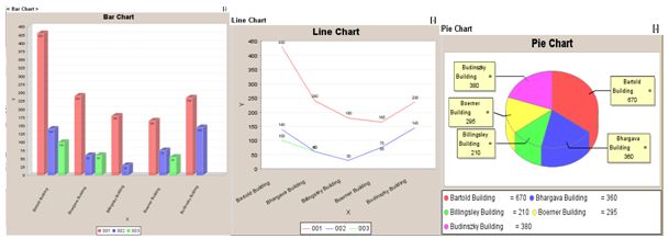
Numbers can be used to create bar charts, line charts and pie charts.
Using graphics effectively requires understanding a few basic concepts:
1 Right size the image
The image needs to be large enough to be viewable. Tiny thumbprint size images of people or charts are too small to be seen. Their inclusion becomes damaging.
Too large does not help the reader. Having a picture of the senior partner take up an entire 8 ½ x 11 page may be flattering, but it rarely adds to the material being presented.
The goal is to find the balance to have the image readable and usable.
2 Resize, crop and optimize the image
Lots of programs can be used to change the physical dimensions of the image.
Within MS applications, images are dynamically adjustable by clicking on the image corner points and moving larger or smaller.
Keep in mind that changing the dimensions can have the impact of changing the clarity of the image. Thus, it is better to use a photo program to change sizes.
Cropping is the art of changing the image to eliminate unnecessary elements that are not needed. This can include too much background, other people, and distracting elements.
3 Placing the image on the page
Images need to be positioned near the text or data it refers to
Practice locating the image above, below, right, left, center to see how it appears best
Recognize the importance of the surrounding white space to avoid cluttered appearance
4 Using color versus grayscale
Learn what color works to best display the material
Printing – match image and text color with paper color – white on white does not work, blue on white can work
Too many colors are bad – 4 per page is maximum
Creating graphics can be done with a range of programs that include MS Excel, MS Visio and SmartDraw (www.smartdraw.com). Excel has features that enable the creation of line, bar and pie charts from data within the spreadsheet. These applications can improve and clarify numerical analyses. Creating a wide range of diagrams such as flow charts, business processes, work flow diagrams, and program design, systems information flow, organization charts are part of 21st century communications. Charts and diagrams can and should do a lot to tell your story. The Key is to translate dull unreadable rows and columns of numbers to readable information.
Beyond charts, there are valuable ways to portray information and ideas. MS Visio and SmartDraw provide a lot of easy solutions for the creation of these types of diagrams. These include, but are not limited to:
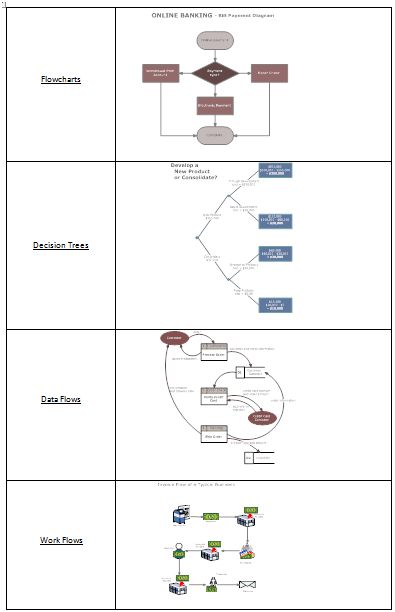
Flowcharts
Decision Trees
Data Flows
Work Flows
These charts are from SmartDraw Templates
Other templates from these applications include network diagrams, Gantt charts, Pert charts, and more. You can create personal and business calendars, project schedules and job management charts, organization charts and even furniture laden floor plans.
Beyond charts, these programs can be used to design simple brochures, product sheets and newsletters.
Which diagram or chart you choose depends entirely on the information and story to tell. The idea is for the reader to be able to grasp the concept and then, such as in the examples above, look at the detail for each component. For example, you can create flow diagrams to explain how various tax calculations are computed, audit steps are to be followed or the installation of a wireless network. These diagrams can be used for training new staff and/or used to educate clients.
SmartDraw and Visio are easy installations and do not take a lot of time to learn to use. They will take time and practice to get good. You can start with templates and get as fancy as you want. Then, using the programs to display what you want to say takes even more practice along with feedback from your own personal editorial staff.
Included in the programs are: drawing tools (shapes, lines, etc.), themes (preset collections of colors, lines and type styles) fonts along with page and paragraph-formatting tools. ‘Help’ is accessible with links to their online web site for more information.
Why use graphics?
Pictures do say more than 1,000 words. They can convey a mood; they can convey complex ideas within the 30 second sound bite time frame that so many folks are bounded by. CNN uses iReporters, every video network uses YouTube, images are the backbone of Facebook and MySpace, and web sites without pictures do not get viewed.
Dig in and start using graphics as an everyday element of your communications style. Accountants can migrate to the world of images in two ways:
Numbers - Translate raw data into pictures that are understood.
Show the ups and downs of the Stock Market averages, or any one stock with a chart
Show expenses as a percentage of revenue with stacked bar charts
Ideas – Translate future ideas with building blocks on a diagram
Design new office space, home office or an entire house
Setup a proposed reorganization of a department or the entire organization
Illustrate how a new system will make the accounting department work better
Being creative to upgrade your ability to communicate requires effort. For accountants, it means getting outside the box – literally and physically – of showing everything with just words and numbers. Developing the skills with using these applications will pay substantial rewards. To be understood should be the prime goal of every person, especially accountants who have something to say. There is a difference in delivering the message and receiving the message. The key, by a wide margin, is for the message to be received in a way that creates comprehension and leads to action by the receiver. Graphics will impact and improve the delivery and communication of ideas, recommendations and enhance every component of understanding.